ALDO TRACY
REAL ESTATE

Aldo Tracy Real Estate is a boutique real estate company located in Orange County, California. The current website has become stale and no longer represents the personal touch that they’d want to offer their clients. Due to her busy schedule, she hasn’t had the time to explore a redesign. Her goal is to refresh the website to deliver a more engaging, personable experience that resonates with potential clients and helps grow her business.

Research Goals
Understand the expectations and behaviors of modern real estate clients.
Identify pain points in existing competitor websites.
Discover how users search for and evaluate real estate agents.
Validate or pivot initial assumptions through user testing.
Problems
Limited Content and Engagement
Weak Visual Appeal
Missing Calls-to-Action (CTAs)
No Property Listings or Search Tools Absence of Personalization
Poor Lead Capture
No Testimonials or Success Stories

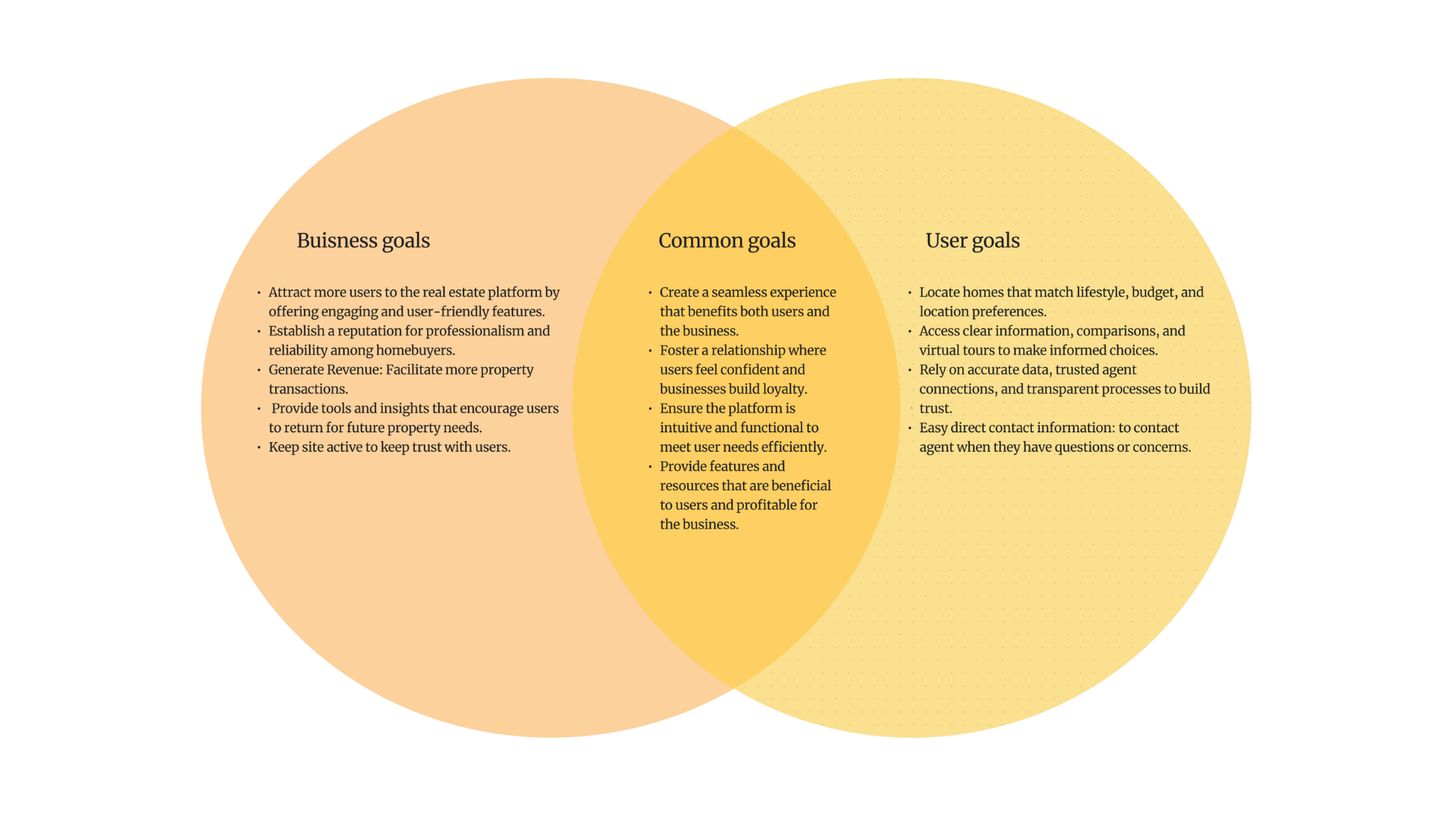
Target Audience
New Home Buyers: First-time buyers needing guidance, educational resources, and reassurance.
Home Buyers: Experienced buyers seeking seamless property searches, market insights, and personalized listings.
Home Sellers: Homeowners looking for expert representation, home valuation tools, and strategies to maximize their sale price.
Real Estate Investors: Investors focused on ROI, market data, and access to high-potential properties.
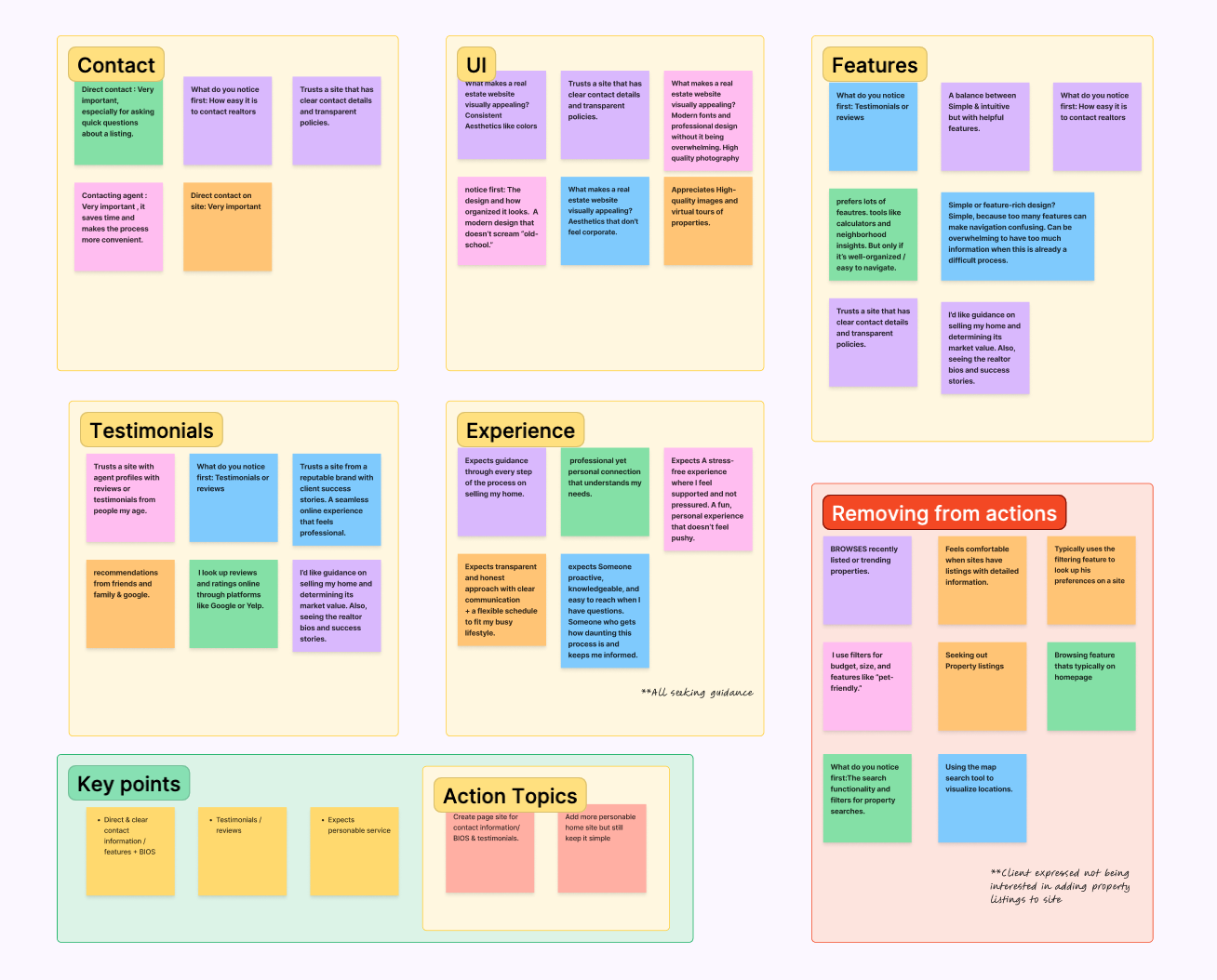
User Research
The usability testing involved 8 participants, ranging in age from 25 to 40 years old.
This age group aligns well with the primary target audience of first-time buyers, young families, and early-stage investors.
Their feedback provided valuable insight into both the functional and emotional needs of modern home seekers and sellers.
Main research:
Understand user needs and pain points.
Benchmark competitor websites for best practices.
Identify effective design and content strategies for real estate websites.
Prioritize features that align with business goals and target audience needs.
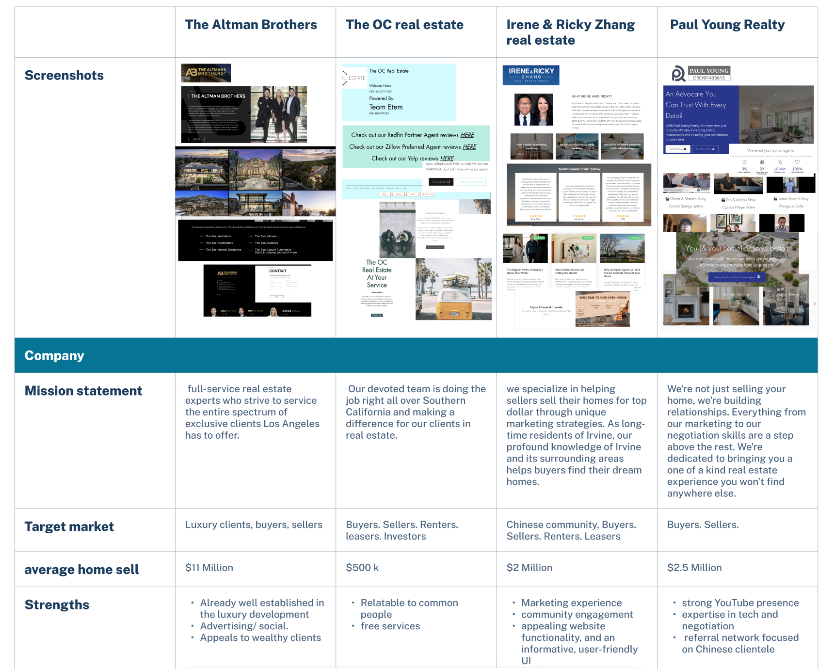
Competitive Analysis
Luxury Focus: Specializes in listings over $8M and high-end leases.
Audience: Targets wealthy and younger buyers via social media.
Branding Gap: May not appeal to average buyers.
Digital Presence: Strong online visibility with slideshow features and YouTube.
Services: Offers buying, selling, staging, investing, and valuations.
Content: Includes stats, blogs, testimonials, and social media links.
Experience: 20+ years, with a focus on the Chinese community.
Community Approach: Builds trust through local events and relatable branding.
Media Strength: Strong YouTube channel and high-quality visuals.
Design: Easy navigation and clear CTAs, though some visuals feel dated.
Limitations: No leasing services; limited personal presence from founder.
Trust Building: Grows credibility through testimonials and transparency.
Key insights:
Trust & Relatability: Users prefer agents who feel approachable and genuine.
Modern Experience: They expect clean visuals, fast navigation, and mobile-friendly design.
Content Needs: Testimonials, success stories, market insights, and lifestyle info are valued.
Common Pain Points: Cluttered sites, lack of info, poor communication with agents.
Brain Storming

Key Features For Site
Create a more personalized site for users to contact business for the “Experience”
Create a Bio page
Create a Testimonials page
Add Social media linked feature
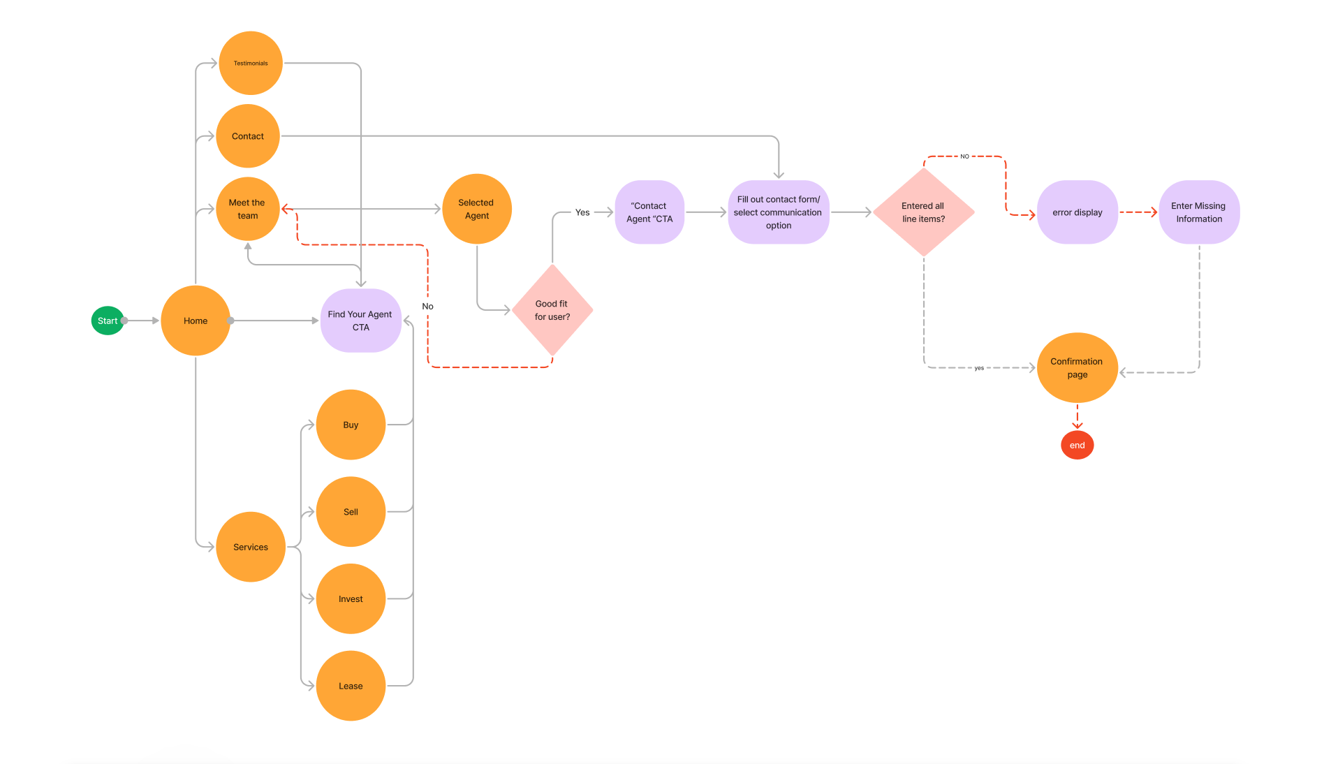
User Flows
I created user flows by identifying key tasks users needed to complete like contacting an agent or finding services and mapping out the simplest, most intuitive steps to guide them through the site.
Each flow was designed to reduce friction and ensure a smooth, goal-oriented experience.
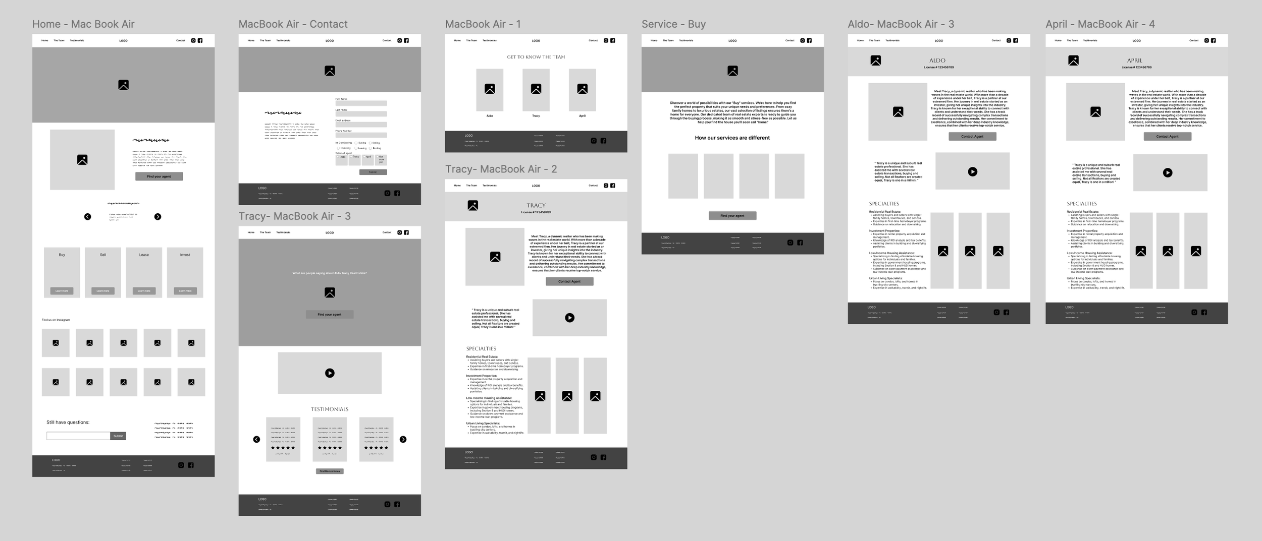
Low Fidelity Wireframes
I created low-fidelity wireframes to explore layout ideas and visualize the core structure of the site without focusing on visual design. This allowed me to test key features early—like contact forms, agent bios, and navigation—while quickly iterating based on feedback to ensure a clear and user-friendly experience.
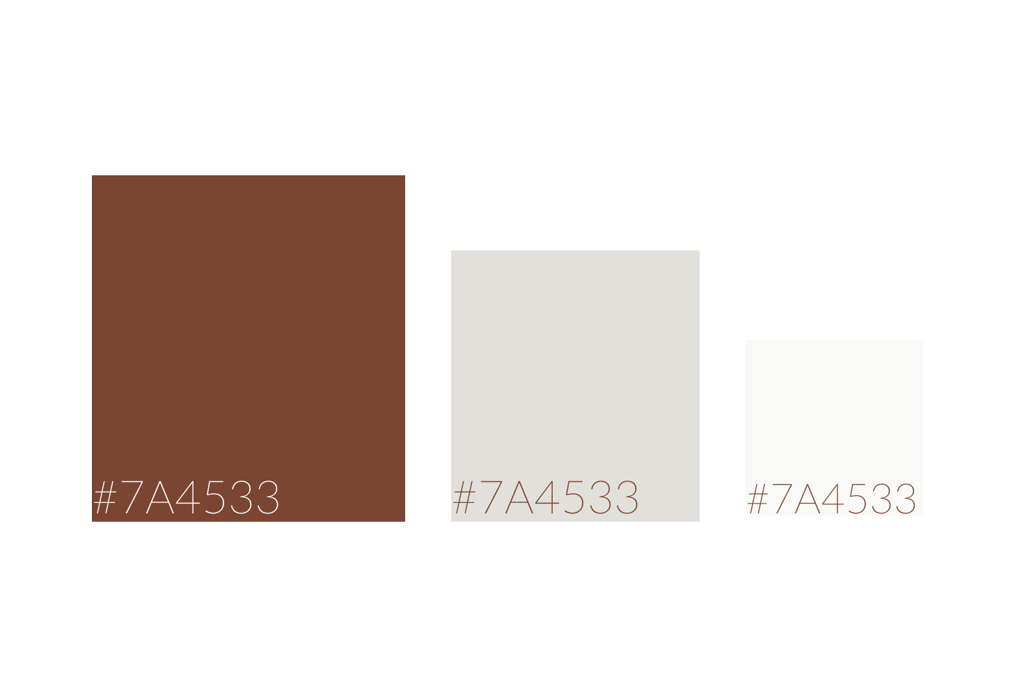
COLOR & TYPOGRAPHY

Prototype Testing Ready !
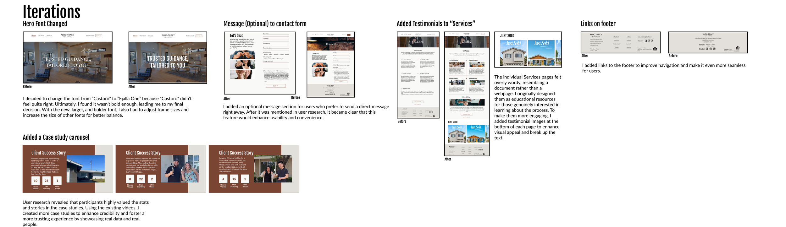
Usability Testing | Key Feedback
Navigation & Usability
Participants praised the website’s clear top navigation and ease of use.
Overall navigation was intuitive, enhancing user satisfaction.
Content & Design
Informative content and appealing color scheme were well received.
Personalized touches, especially in agent bios and reviews, built trust and relatability.
Areas for Improvement
The services section was overly text-heavy and lacked engaging visual elements.
Testimonial videos autoplayed with sound, which was disruptive for some users.
Users suggested the addition of navigation links at the bottom of the site for better accessibility.
Contact form would benefit from an optional message field for greater user flexibility.
Recommended Enhancements
Simplify and visually enhance the services section using graphics and testimonials.
Expand the reviews section with more video testimonials and success stories.
Improve user interface by adding bottom-page navigation and contact form options.
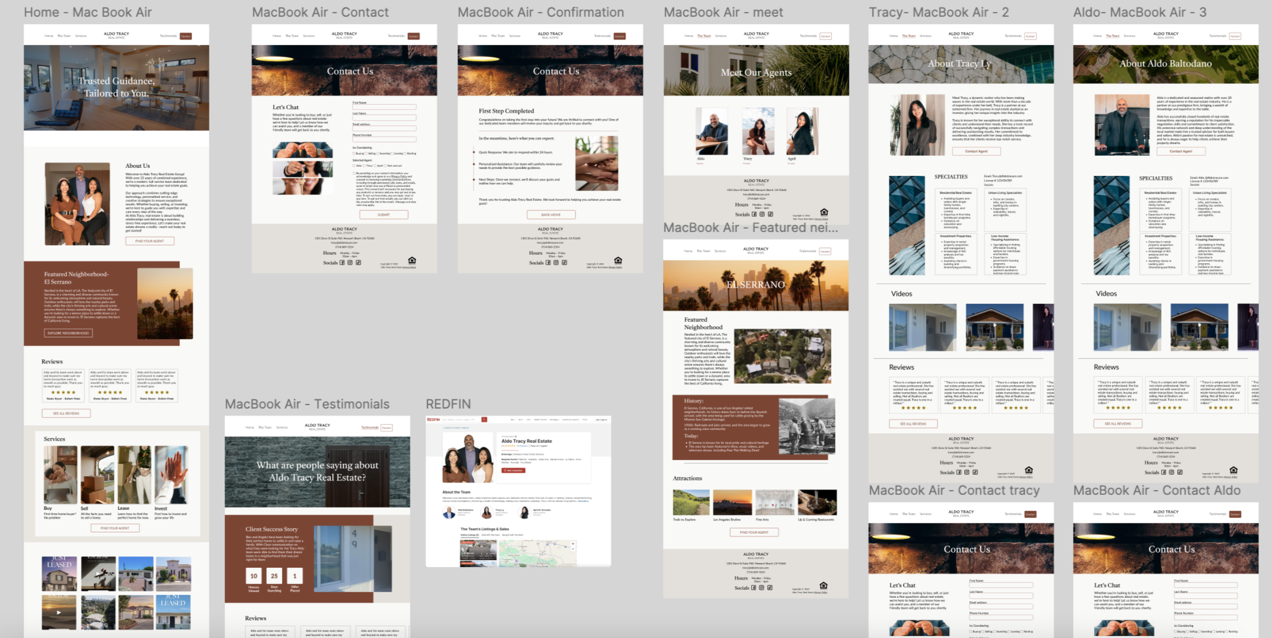
High Fidelity
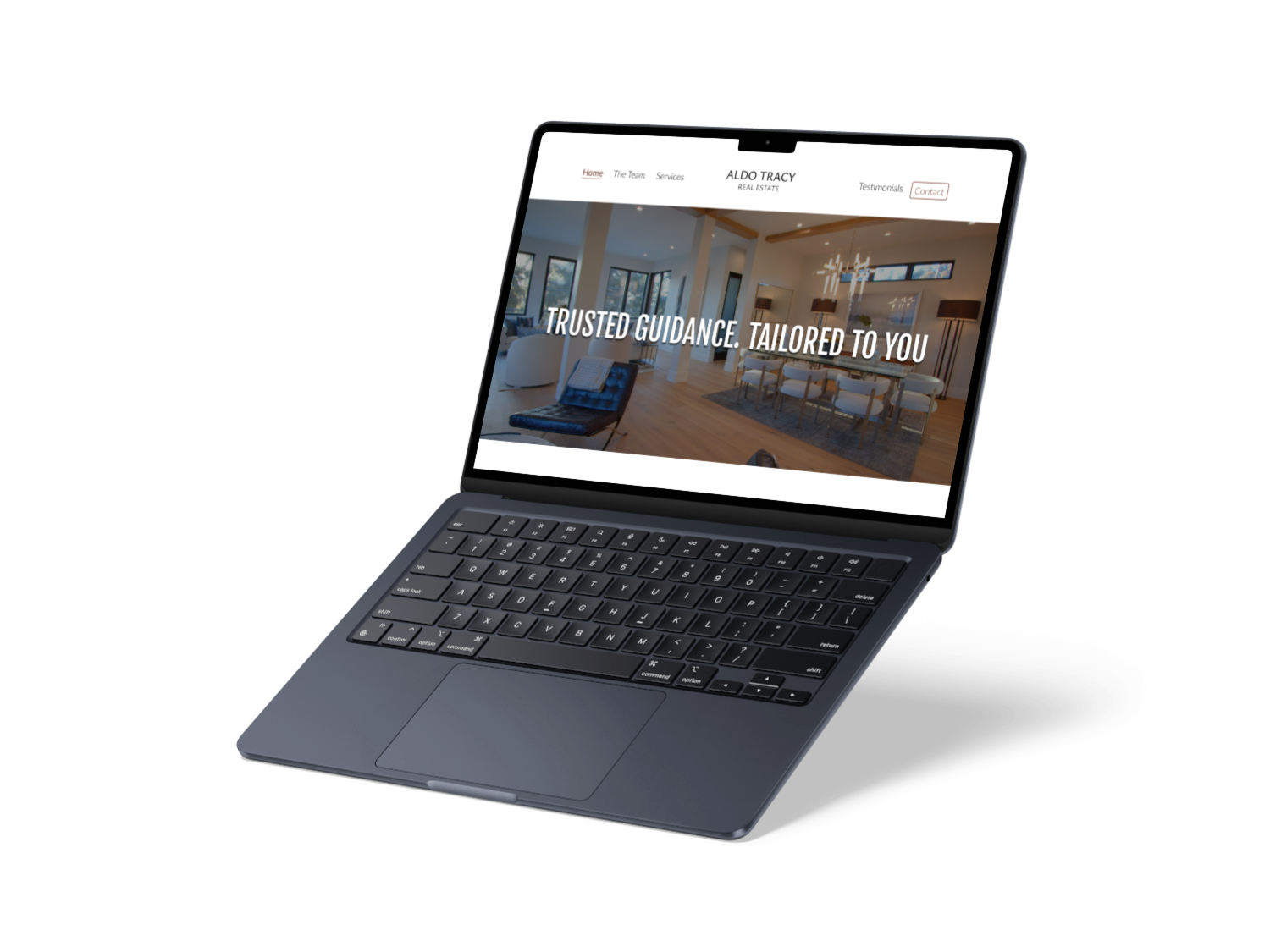
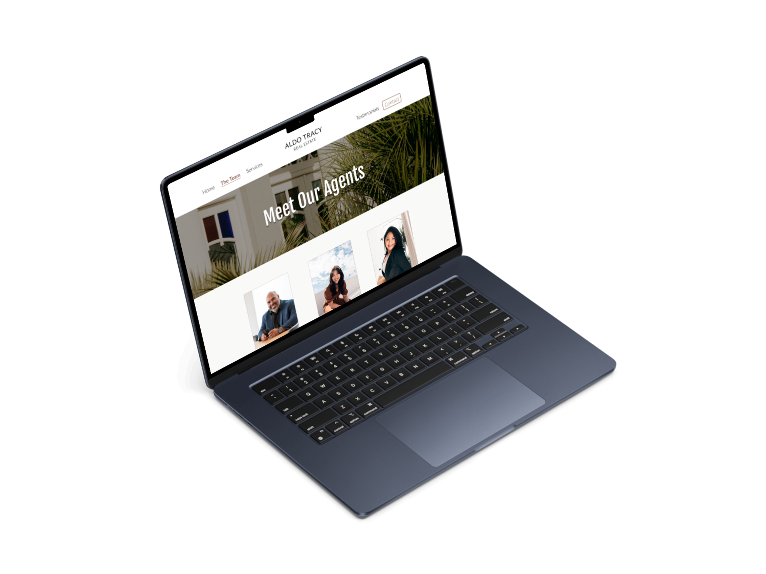

Figma Protoype